The New Food Plate!
- Nutrition
- Jun 2, 2011
-
 No Comments
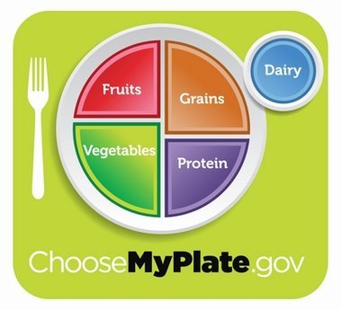
I’m sure you’ve all heard about the new USDA food plate rage that Michelle Obama spearheaded. Finally that food pyramid that’s been around in various forms since 1992 has been banished for good.
(Eek look at all that bread!)
The new plate is supposed to make it easier for diners to understand proportions. It’s simple, colorful, and easy to read. I like it.
By putting it on an actual plate, you can relate to size and proportionality. You can better understand what 1 serving actually looks like when you come to the dinner table.
The new plate also does not take into account fats and oils or sweets. “Meat and beans” is now called protein. There’s also a smaller circle off to the side for your dairies like milk, cheese, or yogurt.
The accompanying website choosemyplate.gov isn’t too bad either. The plate is actually clickable and will tell you what a serving of food looks like. Check out that nifty bowl of brown rice below from their food gallery:
Overall, I like the user-friendly website and food plate. Mine does not look like that though! The grains are very slim and it’s mostly protein, veggies, and some fruits. The dairy bowl on the side can stay because I like my greek yogurt!
What do you think of the new plate? Yay or nay?


