
Voting time! POP Pilates DVD Cover Finalists!
Voting time! POP Pilates DVD Cover Finalists!
Hey POPsters!
Thank you to all of our talented artists and designers for submitting your DVD cover entries this past month! I’ve been watching the submissions daily and soooo appreciate the hard work, effort, and time you put in to making our first DVD together. It really means so much to me!
It was soooooo hard to narrow down the top entries because there were so many awesome covers, but here are the five that resonated with me most and gave off the best Blogilates vibes! Take a look:
A: Orange Bokeh by Tina Alessi
B: Night Sparkle by Shayna Kellie
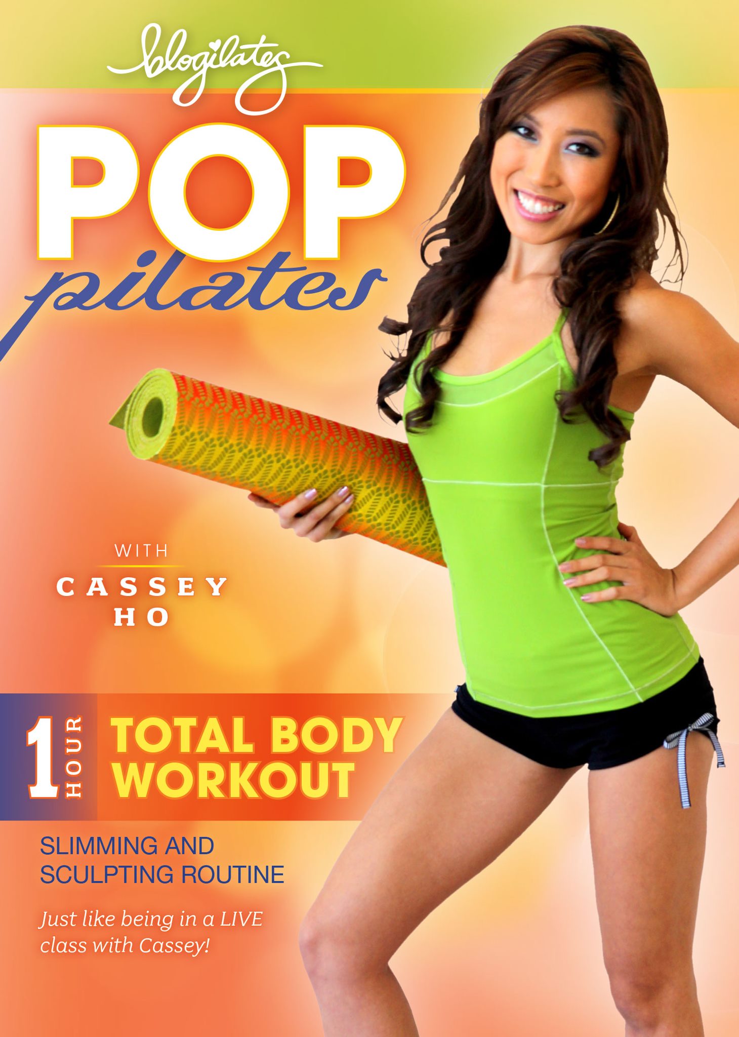
C: As Seen On YouTube by Victoria Breton
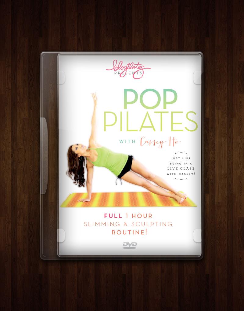
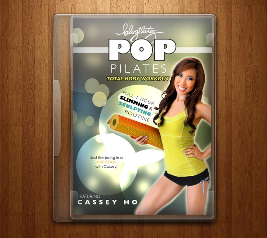
D: Side Plank by Diandra Mezta

E: Warm Citrus by Suzanne Lee Sunwoo
Now…I need your help POPsters! We need to pick the final cover together! Take a moment to look over the entries again and make your vote. Which do you like best?
The voting begins now and will end Sunday Nov 4th, 2012 at 11:59pm PST. Total scoring and final cover winner will be based on 50% community votes and 50% judging by me and my closest friends and family on a 1-10 scale (1 being not representative of Blogilates to 10 – my cup runneth over with Blogilates!)
Thanks for helping me make this decision. I love that we are doing this together! Everything…everything, we always do it as a team and as a community! We’re stronger and smarter that way. I value your opinion and thoughts so much. Also, comment and let me know if you have other ideas or suggestions. <3 Cassey


128 thoughts on “Voting time! POP Pilates DVD Cover Finalists!”
There are 128 comments posted by our users.
Definitely c–you have a tone of great info on YouTube, and you should plug that. Plus this cover is fun, which is why I keep coming back to your channels. Would you be able to use any names of the other media that have showcased you, e.g., magazines? Or some how flag your incredible stats from YouTube on the cover?
D! SIDE PLANK!
D, Side Plank!
C- As seen on youtube =] <3
I wish there was some way to combine C and D…
i keep bouncing between the two. lol but leaning towards C.
I like D because it different, all the workout DVDs I see they’re almost all doing the same pose. yours needs to stand out. I do however like how C says as seen on YouTube but D is a winner for me.
Definitely C!!! I love it! The design is stunning!
I like E too 🙂
Please Cassey make it available internationally!
(ehem, in Guatemala, ehem)
D – Side Plank
D!!!
I am loving the side plank one
I like C, but think you should be facing the cover or doing a pilates , not looking away. I like this one because a lot of your fans FOUND you on youtube. This will help them make the connection:o) Also, POP Pilates should be bigger, again, this is how many know you :o)
Good luck choosing! I can’t wait to get my hands on one!
D. Side plank!
D-Side Plank
I like that this one shows one of the moves that will be used in the workout! Not a lot of people know that POP Pilates is Pilates set to pop music (many think it’s something different) so showing them that classic Pilates moves will be used clears up some confusion. So excited to buy my own! <3 <3 <3
C – As Seen on YouTube.
I like this one because some of the other covers make it look a little too pleasant and relaxing, instead of the energetic and exciting sweatfest that it is!
Well, while I don’t think the coloring is the most attractive, and some of the fonts should be tweeked to grab the attention and set the phrase apart…. The “As Seen On YouTube” says what it should say! The pic is cute, and shows the personality that awaits the viewer, but I’m not sure what you’re pointing it. If you were pointing at a POP bubble with a stand out phrase it would be even better. But the maker of the cover did a good job including YouTube!!
C
C
I don’t know how to vote this but “D” is my favorite!
C is y fav !
D is my favourite!
C!
(also how do you vote on here? do you just leave a comment?)
C
I like D! =)
Definitely C! 🙂
Definitely C! Very cute :]
E 🙂
I love B!
D, definitely is the best. But where it says Full 1 Hour it should just say full hour.
D looks super professional, bright and clean!
The side plank looks the best!
I absolutely LOVE D!!! I loved the colors and the font combinations.
C: As seen on youtube!!
I love them all – but I’m going with C!
C
D 🙂
i like the ‘as seen on youtube’ design because not only does it promote the fact you can be searched ext. on youtube but it’s also fun 🙂
love D.. go with d!!
D: Side Plank for sure…very nicely done..!!! My fave!!!!
Side Plank!!! You look gorgeous which is hard to do in a side plank lol
D!!
D for sure. It’s a clean design that feels uplifting–definitely a plus for a workout DVD(:
C!
I vote for D: Side Plank!!!
I’m so glad that you are doing this DVD! I can’t wait till it comes out!!
Side Plank for sure! 😀
D: Side Plank!!
D!
As Seen on Youtube!
I LOVE D!!!!!
D! Looks so professional and clean!
I like D!
LOVE C!
I want to vote for D 🙂
How do we vote? Just by commenting?
Side plank!!
Great job everyone!!!
I would put the picture of you from E on A.
Or I would re-take the side-plank picture so that your shoulders are aligned. Unless they aren’t supposed to be aligned, but it looks off for some reason and I think (but am not positive) that’s it.
Either way, I am buying the DVD hahaa because you are amazing and changing the world and one of my heroes, so thank you for all of your work!!
C!!
C!!! In love with that cover since day 1!!
Hard to choose, but I have to go with the side plank one. Good job, Diandra Mezta!
D!
I like C. As seen on YouTube. c:
C
MEZTA HAS ALOT OF TALENT…GOOD WORK…
SIDE PLANK IS A WINNER…MEZTA HAS ALOT OF TALENT
the side plank one is so well done! it looks professional, and the other ones look like the cut of your body didn’t go well.
I liked C the best because of the pose you’re using; it’s fun, different, and shows off your energetic personality. If I was staring at a wall of pilates dvds, that’s the one I would grab.
It was a tough call between C and D. I think C is slightly better in how it’s put together and the writing is bigger and more eye catching. The picture really captures your personality too! It’s so pretty and looks lovely and fun.
I would have liked a little more girly entries to be chosen , don’t feel they really represent you Cassey 🙁
Hi Cassey,
Will you offer your workout on iTunes? That way we can use our mobile devices to workout whenever/wherever. Great option to think about!
Cassey, I like Victoria Bretons design, but with the photo where you are looking into the camera holding yoga the mat. I also like the first one by Tina, because your name and “total body workout” are spelled in big letters.
Great job all anyways from all of the designers!
I voted for D. I really like the title on it, and I love that it actually shows an exercise. I think the colors make it fun and spunky too without being overpowering. D’s the best!
I vote C.
My vote for c
Could you do a challenge to tone up chest muscles?
I voted for E. Warm Citrus. I love the colors and the pose.
Although I chose “A”, I really like “D” the best. Actually, all of them are fabulous!!! Why not use all of them in the future for different exercise routine/workout DVDs? Or use another on the back of the DVD cover??? I also like the words, “as seen on YouTube”, so that would be great to have it on your dvd cover at least.
Hey Cass!
My vote is probably for the orange Bokeh design. But I kind of overstretched my hamstring so now there’s a strain on it. I know I should rest it, so what should I do to work out. Also it seems like I overstretch quite often. What should I do? Thanks! Xx
A all day. Vivid colors and thoughtful composition from top to bottom.
I love “C: As Seen On YouTube” – definitely! It’s a great combination of fun and fitness!
Really nice! In the end, I chose A because I love the colors in it, especially the little pop of blue-purple that goes with your eye makeup. It just looks really warm and eye-catching.
and um I was just reading your mini bio on this site to make sure I wasn’t mistaken about your background and saw that you were in the Boston area for a bit, and the first bag you designed was the “Beverly Bowtie”… that wouldn’t happen to be named after Beverly MA, now would it????
Ms. Cassey Ho, I don’t think these covers match what design I’ve seen in your videos, this website, and your printables… . I actually really like the work you’ve done yourself (you have been doing it yourself I think I read/heard somewhere?) which I’m kinda surprised by because I don’t think you have a background in art and design that I know of, yet the typography and graphics you’ve used, for example in the “bikini blaster series” and the calendars you’ve started making really capture you and what I think you’re about. They’re so fun and .. . “perky” and cute. But I guess who can represent you better than yourself, right? You are tired and busy I suppose, but if you could tweak whichever cover you end up going with, so that it has your own personal touch.. .
thanks so much for your input! yeah, i wanted to do it myself but I’ve been so bogged down that I need to get help.
D is my favourite, because it is so clean, fresh and different! I love the others, but I think D would stand out amongst other workout DVDs on the shelf. It makes me want to crack it open and start working out straight away 🙂
C: As Seen On YouTube by Victoria Breton
The way you’re posing and kind of laughing in this one shows off your bubbly personality and shows that your workouts and fun and upbeat, not boring and mundane.
AGREE!!! I chose C. For the same exact reason. Your personality makes your hard workouts fun!! If I was choosing a DVD off the shelf, I’d pick you! Enthusiastic and casual, yet professional and sweat-worthy. Look how far you have come! Congrats!
I think D best represent what you’re trying to do!
LOVE the side plank cover BUT the DVD market will introduce you to a whole ‘nother audience and consumer so I thinks it’s important for your fave to be front and center
face*
They all look awesome!
Just commenting to say that I really appreciate all the votes I’ve received. I hoped Cassey and the Blogilates community would like what I did with the cover!
There are some seriously talented people in this community, some of you girls really challenged me to step up my game! Good luck to everyone! 🙂
I love A! The colors draw me in. But it would look a lot more profesh if your picture was like it is on B with the smooth hair and the back light. =-)
those are so nice! And ahhh glad to see I have good taste 😉 the one I chose is def. a popular one I see! Hehe
I’m a graphic designer myself, and I must say it is important to do what the client asks. I like CHOICE D, because she didn’t put the YouTube on there as requested by Cassey. I think some of them are cute, but hands down, CHOICE D is the best because it’s very professional looking. I feel like the rest are just too busy.
I voted for the side plank ‘cos i think that the others are more appealing for people who already know your amazing self. And to introduce it non-POPsters I think it is best with something that demonstrates the effect of POP Pilates and clean eating 🙂
I vote D! Side Plank for sure 🙂
soo difficult to choose! i went with “night sparkle” but i love all the others as well.
though i think some people might have voted for the thing they didn’t mean to vote for, because at first i thought the letter and name for the cover was above of it, but it’s underneath it, so idk if everyone noticed that
The side-plank one looks the most professional by far!
I like D best, but maybe make the “presents” under blogilates smaller, so it’s not covered by the Blogilates word. It’s the best one. The one with the as seen on youtube has too much going on and you’re not sure what to read first. It also looks kind of more pimpish (right?!) vs a pose from your workouts (which I love BTW). Definitely put the as seen on youtube there (even if it’s small), because that would make someone go on youtube and see if it’s worth it to buy (try before you buy). Even without it though, that is the superior one!
I lOOOOve the “as seen on YouTube one because you face is just so sweet and adorable. It shows your personality perfectly. Also love the “night sparkle” one. Jus wished they had used the other picture of you. Xoxo
I would have picked D but I didn’t like the font of Cassey Ho’s name. C looks very official. A and E look amateur because of the low quality around the hair. It’s not crisp. The font on B is too small. For me it was between B and C. I agree with others the “as seen on youtube” is a nice touch.
At first glance I was drawn to both A and E because of the warm colors. When I think of exercise I think of heat, movement, warmth. A warmer color is going to motivate me way more than a cooler color to get off my bum and do some pilates. As I studied the covers more I realized I very much like the layout of B but the colors are too muted and the letters are not big enough. The side plank is clean and nice because it shows Cassey actually doing pilates but I don’t like how the words “Blogilates” and “presents” overlap each other (kind of messy). The font that “Cassey Ho” is in either needs to be changed to something more legible at that size or increased in size and I feel like all the words in general need to be a bigger size. Option C is very nice and clean, but a little boring. Also, the actual pose that Cassey is in is kind of weird and the picture itself looks kind of fake and touched up. In the end I chose E because the letters and graphics are large, clean and easy to read, the fun warm colors are attractive and motivating and the picture of Cassey herself is more natural looking than the one in option A. Hope this helped!
wow great analysis!
I actually liked the less popular orange citrus, but I agree that the “as seen on you tube” should be in there somewhere. I think it’s important to tie that in.
yes i like it a lot!
I voted for Warm Citrus, because the color matches Cassey’s sunny personality and is more uniform than in the others, because I liked the picture of Cassie, and because I liked the “presents Cassey Ho” verbiage. There ya go! But all were very cute. Go Cassey! me
I had a hard time choosing between C and D. I voted for C because it has the “as seen on youtube”. I would buy C before D just because it states that you are on youtube. It tells me a little bit more about you. I do like D’s layout better.
Something’s wrong here, I tried to vote and this is the message I got:
“You Had Already Voted For This Poll. Poll ID #3”
i love A and E bc of the warmth that the orange/citrus colours radiate.
in the end i voted for A just because that figure “1” in”1 hour workout” somehow reminded me of an award or a label – with Cassey having won the award and now officially being the No. 1 pilates teacher 🙂
but the other four would deserve to win, too! all of them are fantastic!
I do like the plank one but I feel like it is a bit misrepresenting. It looks calm and relaxing, more like yoga and we all know Cassey’s workouts are anything but calm! So I went with warm citrus!
I love the D. I feel awful even mentioning this but I’m deaf and communicate using American Sign Language (ASL); every time I look at C, I see Cassey signing the word ‘lesbian’. That hand in the L shape on the chin is ‘lesbian’ in ASL. If you look really hard, you can tell Cassey is not actually signing that and it’s a pointing to yoga mat move but if I or any other signers walked by the DVD on a shelf, we’d do a double-take. If Cassey retook the photo moving her arm and hand lower keeping the pointing style, it wouldn’t be confusing and looks better. 🙂 in fact if it wasn’t for the hand on the face, I’d have a hard time choosing between C and D.
I liked the C: As Seen On Youtube the best but then after looking at all of them closely I notice that Blogilates is not what the DVD is called. It’s POP Pilates. I thought it was cute how big her Blogilates logo was big it’s confusing as to what the DVD is actually called. :/ I love the C style the best and the photo of Cassey (minus the red hair that Victoria already said she would fix) but I think that the D: Side Plank is more straight forward with what it’s called. I think that’s important for when she make more DVDs. Overall, C & D are definitely more Cassey’s style but everyone did a great job!
I like both C and D. They all look clean, professional, but yet cute. I chose D because of the picture. It’s a lovely picture and shows you working out, your body.. something more pilates related.
but I like C’s fonts and colors better.
I’m not wild about the pose for A, B & E. . .it looks too much like the cover of Jillian Michaels’ “Yoga Meltdown.” I voted for C, but D is awesome, too!
I like C because it showcases you as an individual and your style. The pose is so you. The composition is great, the text and colors are lovely too. The fact that the image of you is so big really draws in the eye and it shows off your body nicely too. D is lovely from a graphic standpoint but I think the muted colors and small size of you would have customers keep on walking. If I saw it in a store I would think, that’s pretty, but I would not feel compelled to buy it. C has that “pop” factor and embodies your personal style to a t. The “as seen on YouTube” tag is cute too. It’s awesome overall.
I was torn between C and D, but I really LOVE how C shows your personality on the cover. It would make me want to pick that DVD up in the store, hoping that the workout would be a little more fun (which they are!). Good luck to talented contestants 🙂
Exactly! It makes it look more fun. And since this is a dvd you are hoping to sell… Ok the visitors of your blog won’t be intimidated by a sideplank but beginners might be. When seeing the photo of the sideplank people might think this is wayyy too difficult! Which is a shame because I like the design. But I voted for C because it makes it look like a fun workout.
I think D is by far the best. The problem with C is the composition: most photographers would have set this one aside because your hand is blocking part of your face. That’s a composition faux pas. D, on the other hand, is beautifully composed, clean, and simple. I think people would be very drawn to that cover on a shelf because it looks different than lots of other fitness DVD covers right now.
Thanks for the comment about my entry! You pretty much nailed what I was going for with my designs. A lot of fitness DVDs look the same and I think because this is such a unique community, it deserved a similarly unique DVD cover. And I like to keep things clean and simple; if it’s too busy people can’t easily discern what’s going on in a glance.
I would have added the YouTube bit but Cassey didn’t ask for it and I really like to defer to the client rather than make choices on my own. I would happily add it if asked though.
Again, thanks for the positive comments! 🙂
As seen on Youtube! Fabulous!!
Love C. as seen on youtube! Sure wish you were looking fwd so we could see your face though! The colors are so attractive to the eye. Calm yet vibrant! Fun!!
Thank you! I let my main sources of inspiration fuel my design — Cassey’s enthusiasm, and the fun, welcoming Blogilates’ community.
Thanks again. 🙂
I think A:Orange Bokeh looks very professional. I love the layout too. It really is in order. The color Pops too! It’s bright and inviting. I can see it standing out when you browse through workout dvds online. I think the others are dull and they just don’t appeal to the eye. Hope this helps!
Love the C one, it really mixes the sport and your energy and joy, and really the best done, the best esthetic (pardon my english)
I like “C: As Seen On YouTube by Victoria Breton” the best but your hair doesn’t look so good on it. If it gets choosen, Victoria should work on your hair again 😉
Thank you! I think the hair was like that in the original .psd file, but of course, I would be more than happy to edit that if chosen. 🙂